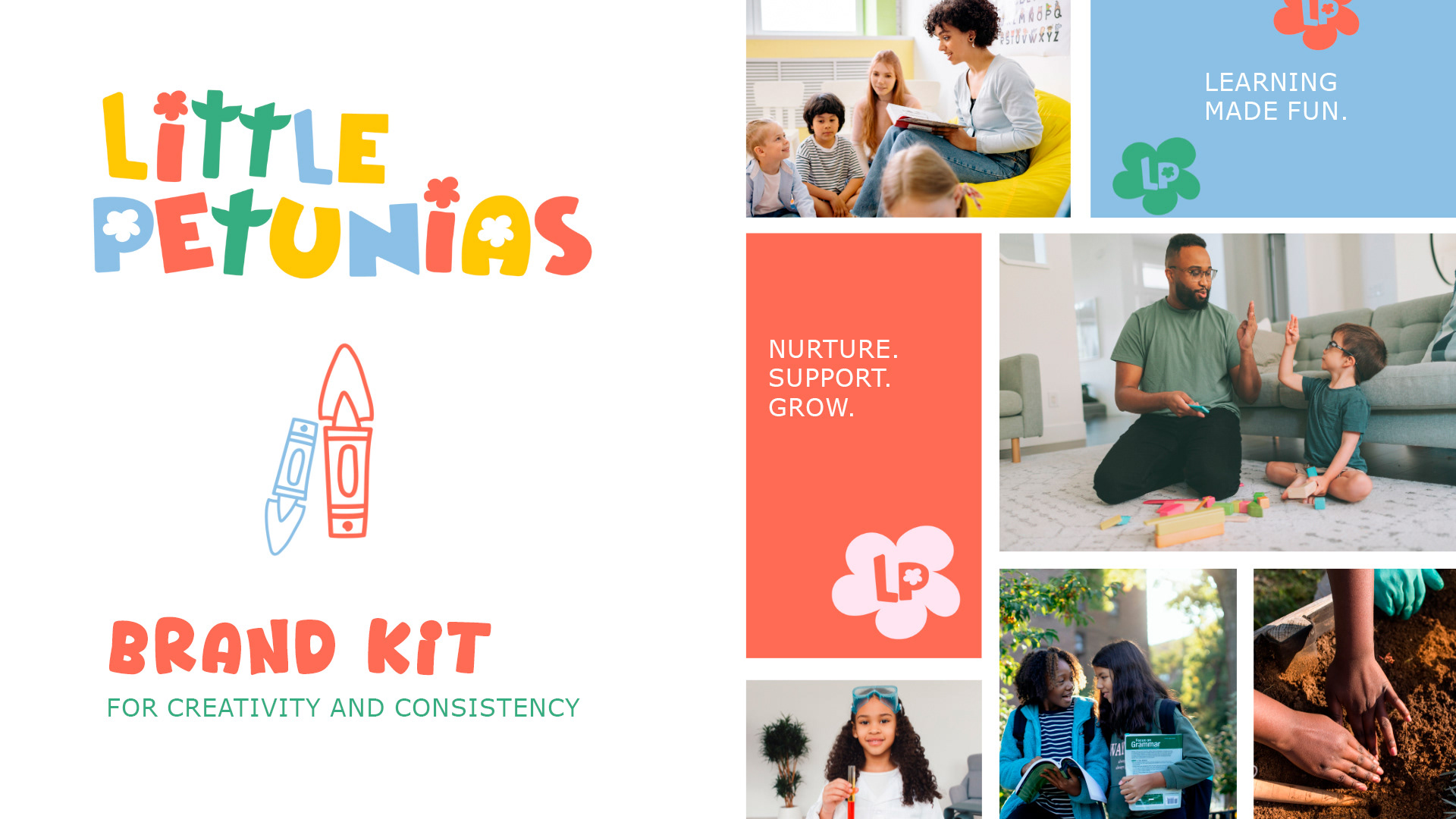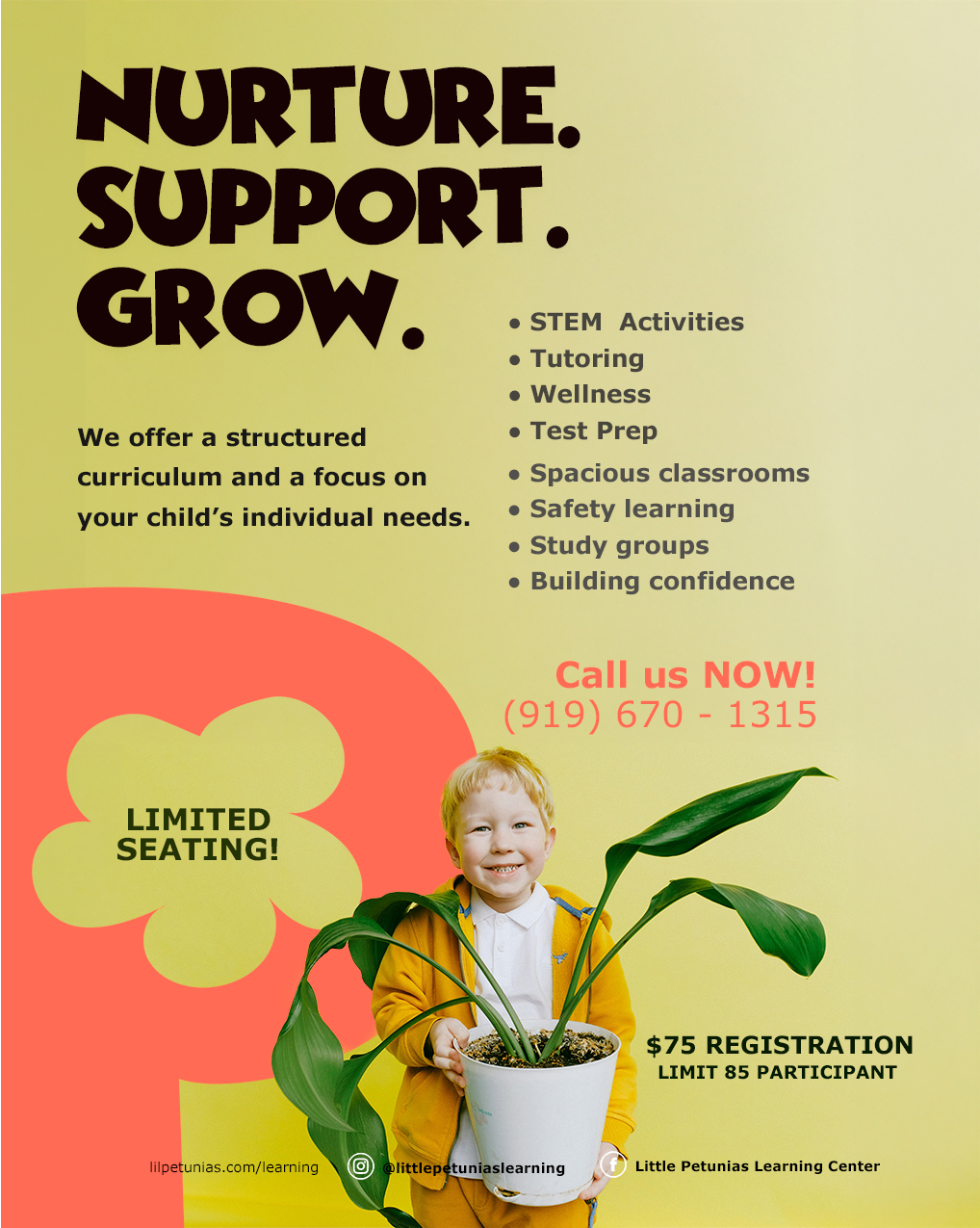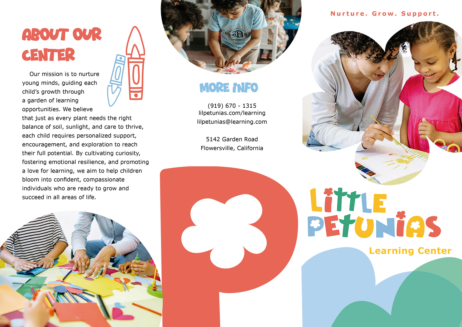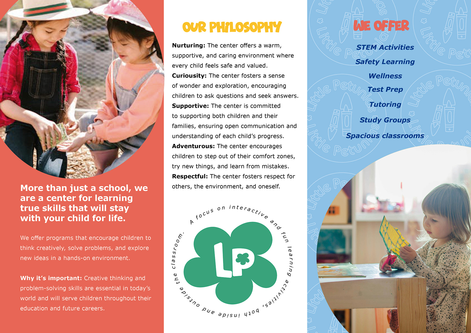

Project Summary: This mock brand for a children’s learning center was designed to establish a warm, playful, and engaging identity. Rooted in a gardening theme, the brand symbolizes growth, discovery, and hands-on learning—core values of the center’s educational philosophy.
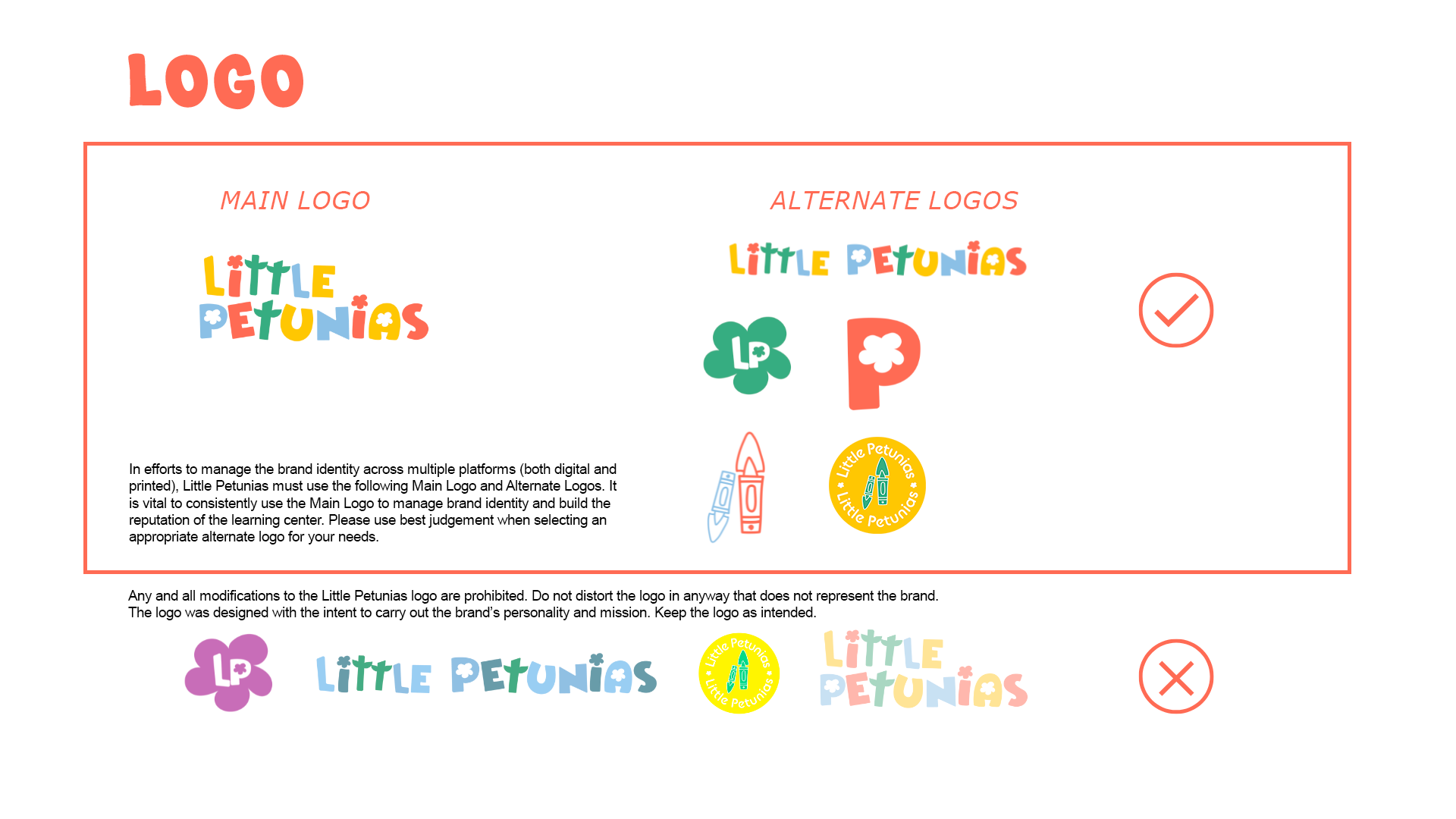
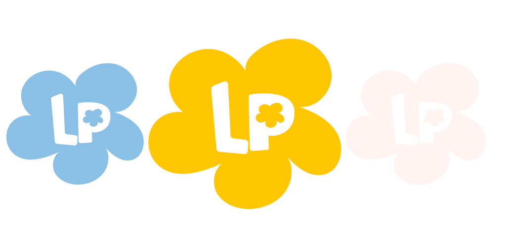
The logo design takes inspiration from the tactile nature of childhood creativity by mimicking the look of school art projects, i.e. flower paper cutouts. The flower and leaf motifs, with their handcrafted feel, reinforced the core values of the center.
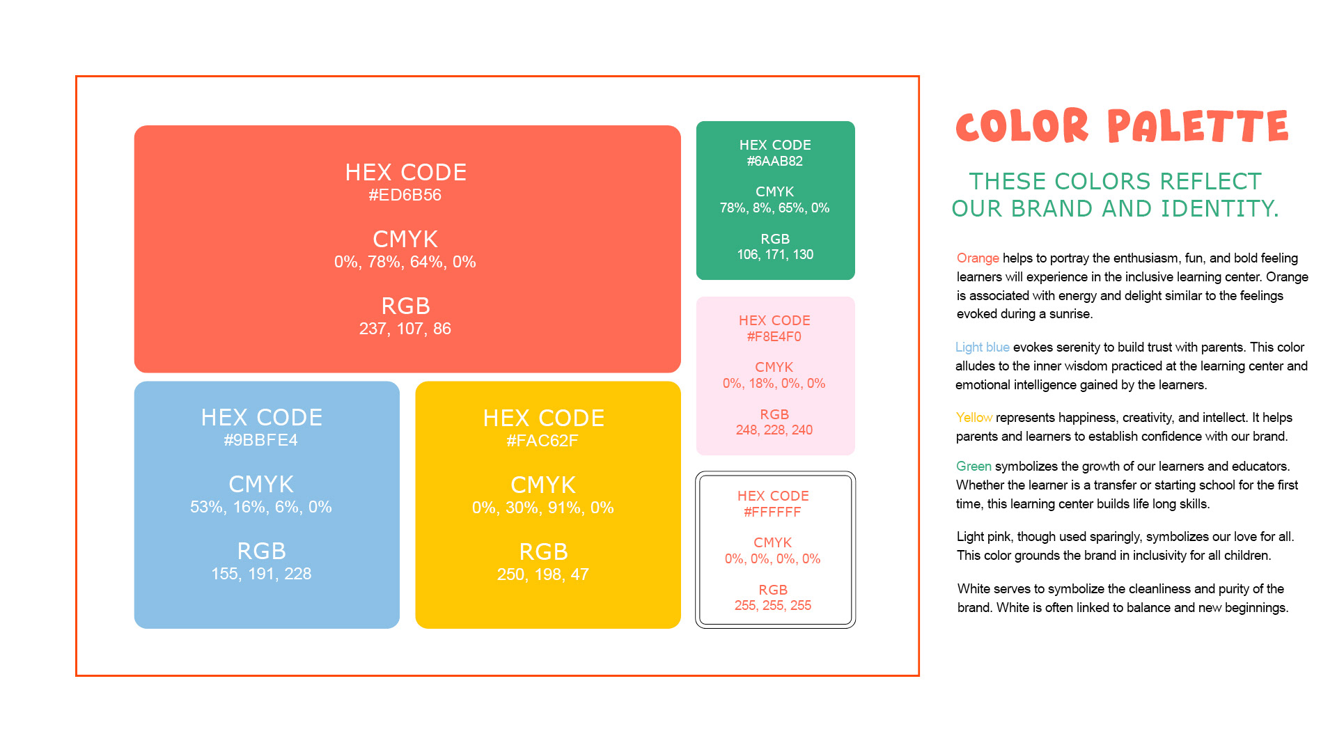
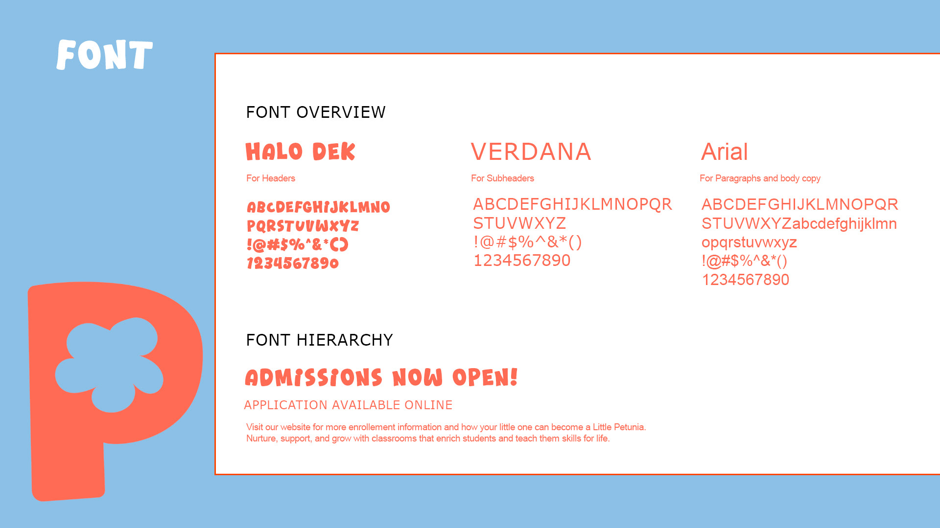
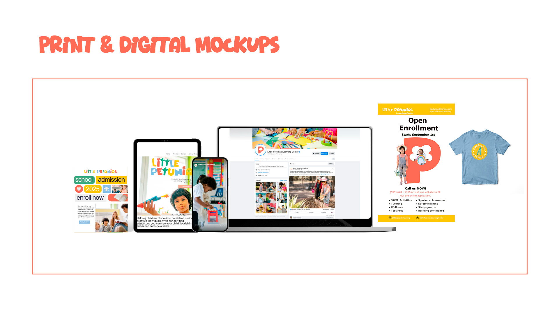
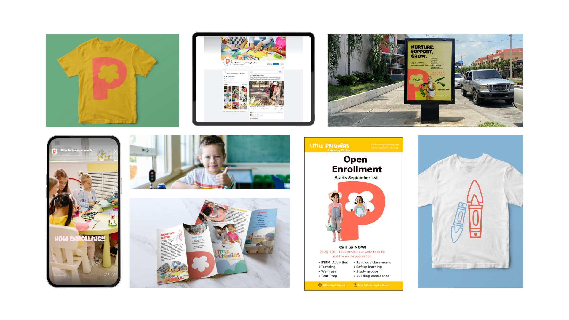
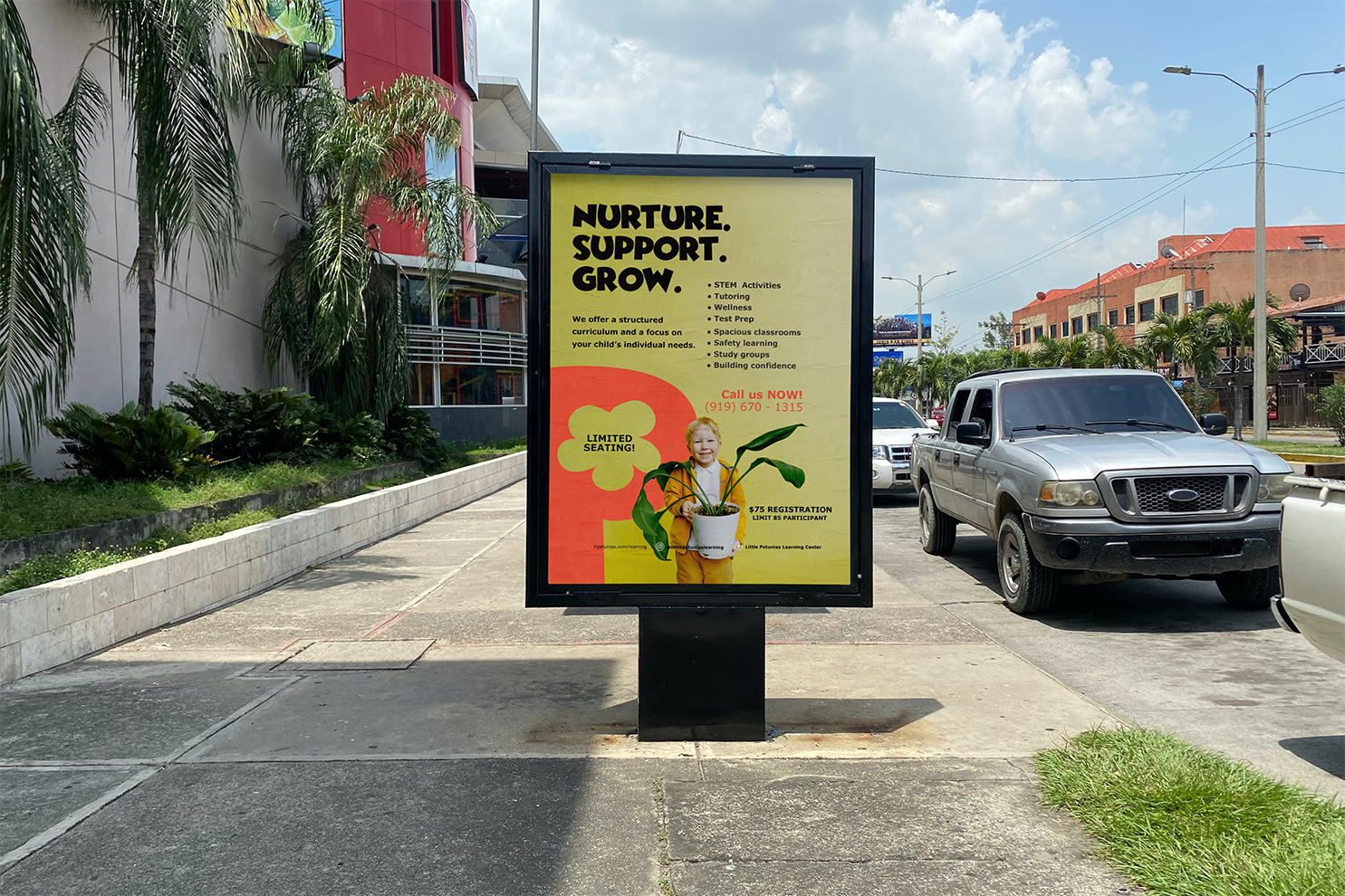
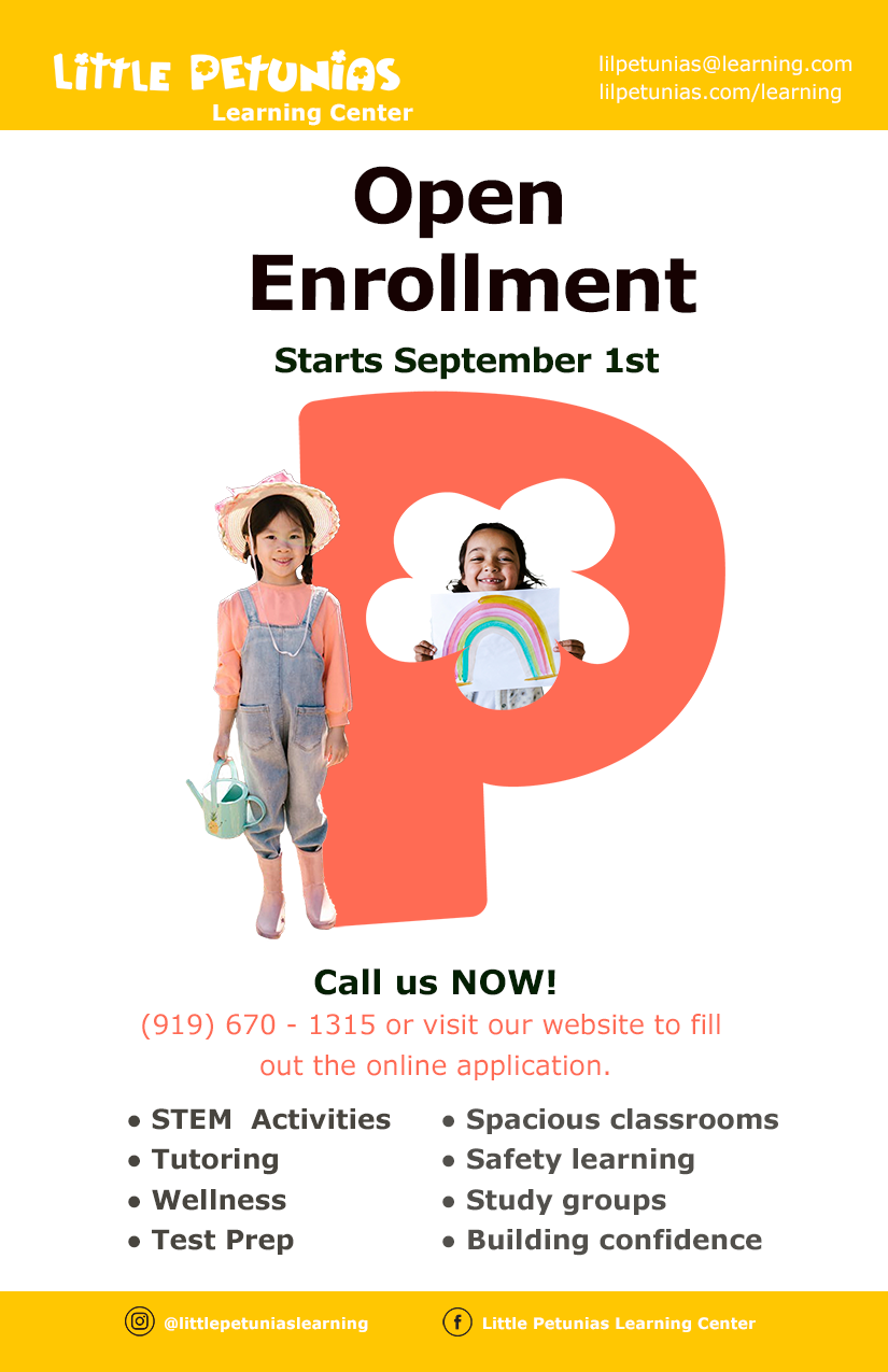
A vibrant color palette of green, orange, and yellow elicits growth, playfulness, and happiness to the brand—making it both fun for children and trustworthy for adults. The branding package includes a cohesive visual system: a versatile logo suite, branding guidelines, assets for social media, branded merchandise and print materials.
Together, these elements create a trustworthy and joyful brand experience that supports enrollment goals, attracts educators, and positions the center as a nurturing environment where young learners can thrive.